Final magazine deliverable
The Big Questions
What design elements do the most successful albums have in common? How do they communicate the sound and style of an artist? How can I incorporate these elements into the visual identity of a small artist?
The Answers
Top-selling albums have many things in common-- color usage, photographs, similar typography, and marketing decisions. There are certain tactics that are popular for a reason, but there are also many opportunities to experiment and create a visual identity just as unique as an artist's sound.
Initial Research
My research began with the analysis of successful albums to see the most used tools within the industry. To do so, I looked at the Billboard Top-Selling Albums of 2020. I created a spreadsheet that was able to quantify the number of times certain colors were used, what kind of typography was most common, whether digital art or photography was used and to what extent, how many singles were released, and many other factors. I then took a look at the way each of the Top 10 Bestsellers were promoted pre-release day. My research showed that the colors black and white, as well as blue, red, and pink were the most represented among the Top 100, that sans-serif typography was becoming more popular than serifs, but decorative/display fonts were still popular, and that having an artists' photograph on the album cover was very important. I incorporated my findings into an infographic (pictured below).
Initial icon sketches
Final infographic
With regards to the Top 10, a large portion of them used some kind of mysterious element to keep people interested: Taylor Swift didn't announce her album "Lover" until the night before it was released, while Harry Styles had cryptic billboards for a fictional travel agency that advertised trips to a fictional island named Eroda, which became the main element of his "Adore You" music video. Other artists also used similar clues and teasers to keep people engaged. I wanted to make sure that the band I chose to brand made use of similar promotional tactics on their social media.
Album Branding
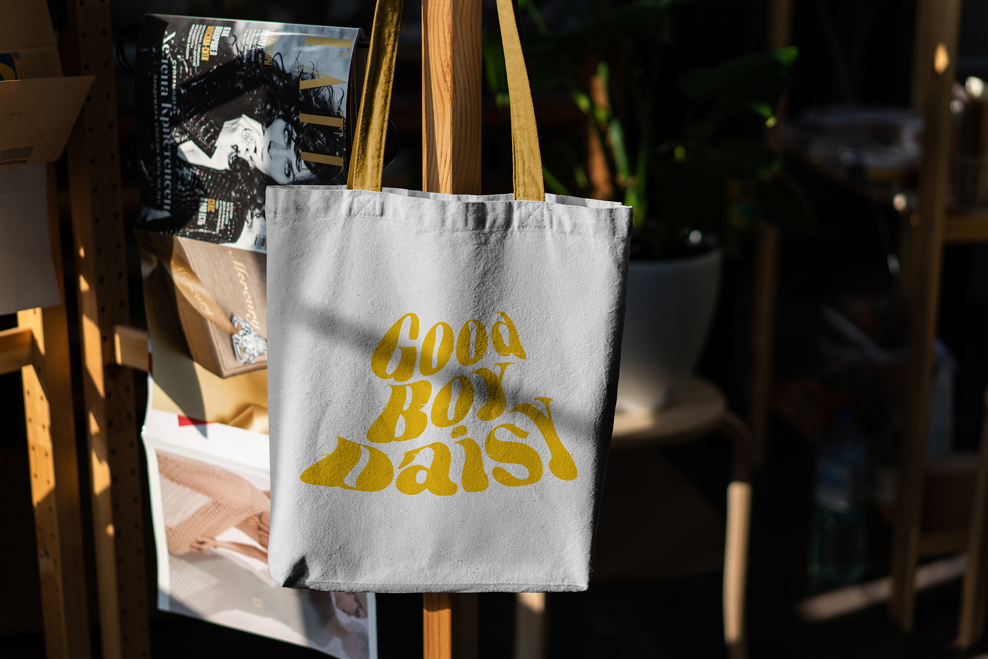
Once my main research was done, I began the process of branding a small indie-pop artist named Good Boy Daisy. They haven't yet released their debut album, so far they only have 5 songs released. I thought this would be a perfect opportunity to define the look and feel of an album without being influenced by what an already existing album looks like, and I also wouldn't be redoing the work of another designer/design team. I began with their logo, the original one was somewhat difficult to read, so I opened up the letter forms and stacked it vertically, which allowed me to play more with the wave-like feature they already had going. It now feels much more open, easier to read, and just a tad bit groovier.
The data I collected earlier showed that blue was one of the most versatile and popular colors, so I made sure to incorporate it as part of the final color palette, but this seemed like a good opportunity to stand out by using a contrasting color, so the main color is a warm yellow. I tested out a couple different color palettes by selecting colors from within their "Summer Rain" music video and various photoshoots they did.
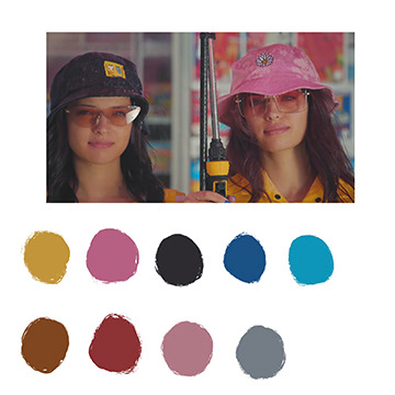
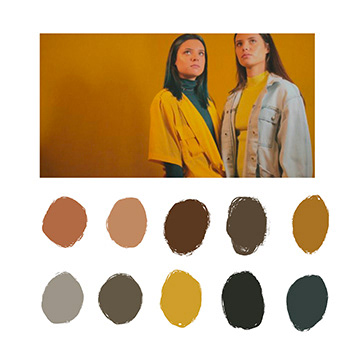
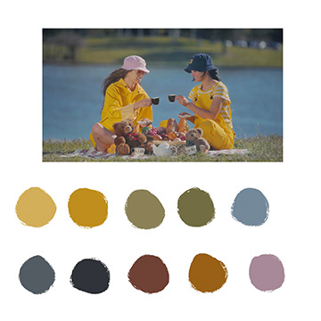
Final color palette
Album Art
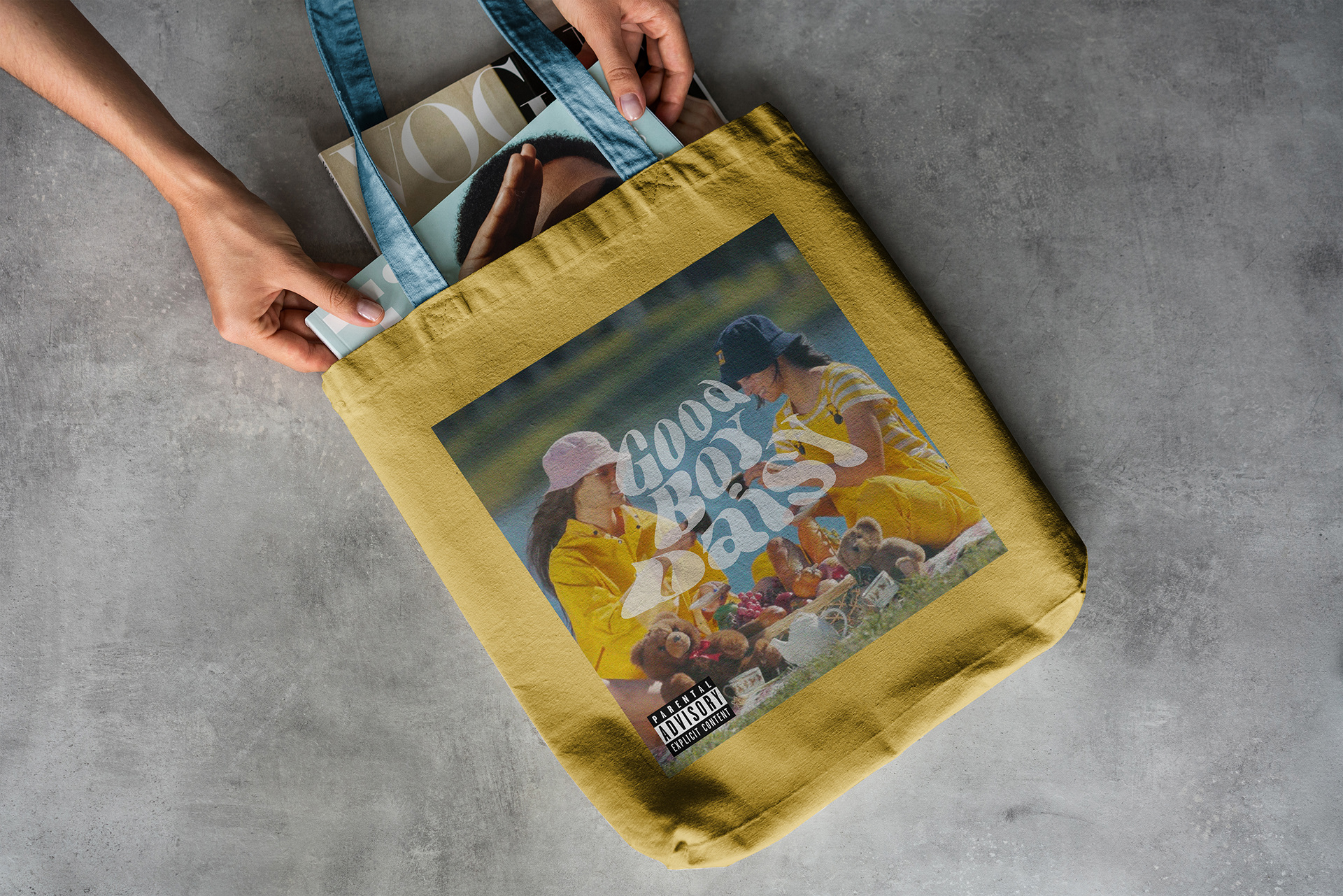
My research showed that it was important to have a photograph of the artist as part of the album artwork, so I decided to grab an image from their "Summer Rain" music video, as it already fit well with the color scheme. I tried a couple of texture filters, but decided to just do minimal adjustments and add grain to the image. The majority of my album art work was playing around with type placement and opacity.
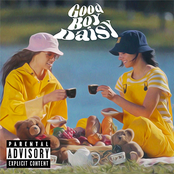
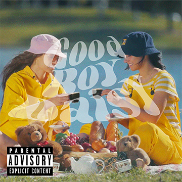
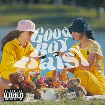
Final album art
Social Media Posts
I made 3 Instagram posts that would promote either the release of Good Boy Daisy's debut album, or the concert they were having on November 2nd in Arizona. After critiques, I decided to scrap the more illustrative one, as it didn't fit well with the style of the other posts or the album itself. I also received feedback that the mosaic one didn't have enough detail and wouldn't attract interest, so I opted to make the tiles smaller and also specify that it was advertising an album release. That way, it gave enough information that people would understand what it was, but little enough to be considered cryptic and pique people's curiosity.
This post was scrapped because of the difference in style
It was hard to tell what this was supposed to represent, so more detail was added (see below)
Final social media posts
Pretty Mockups
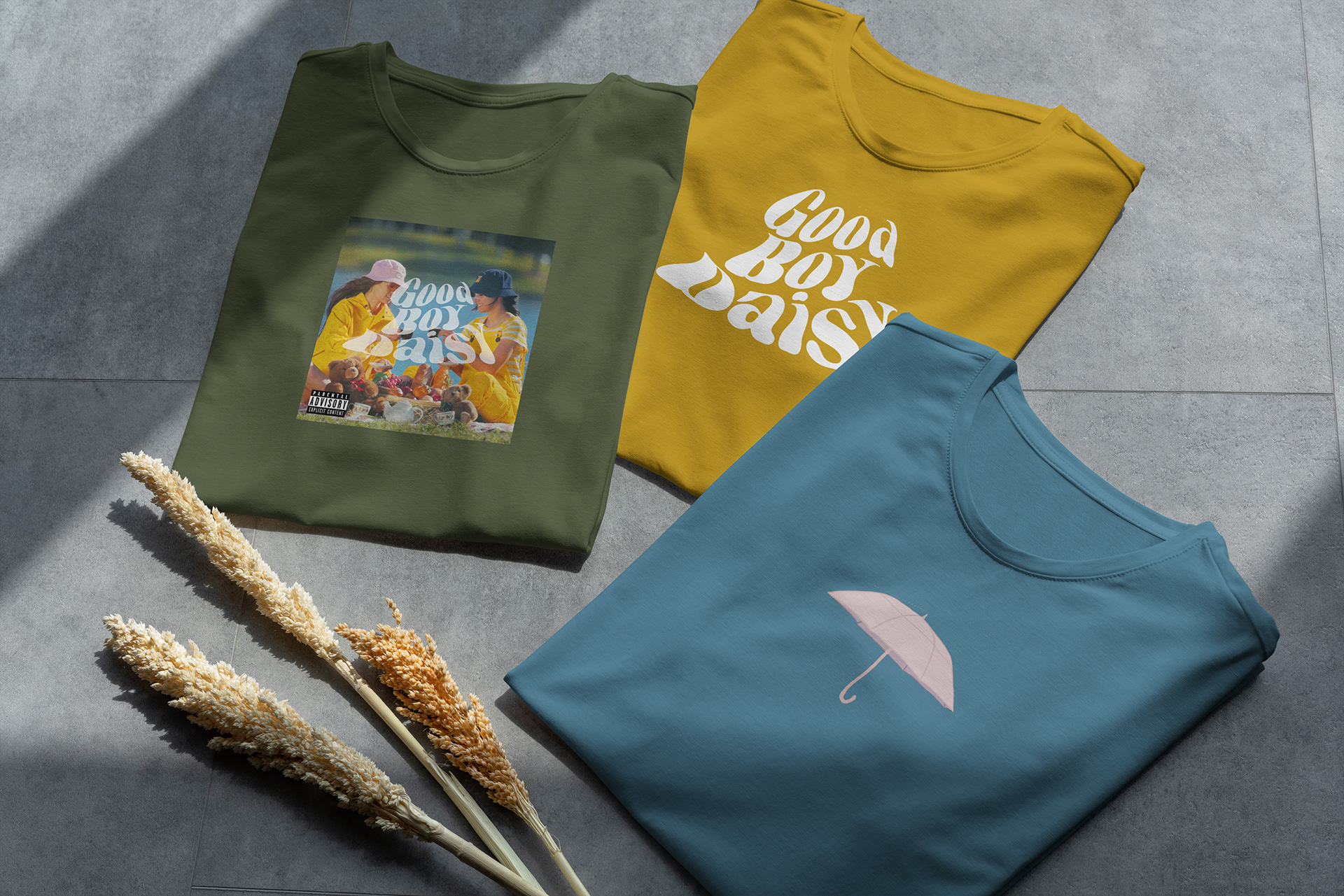
These are a selection of some of the mockups I made for this project, which would be sold as band merchandise.
