The Brief
Create illustrated branding and packaging for a coffee shop opening on the Eastside of Detroit. They offer workspaces, a few kids toys, and a mini library for you to leave/take a book. They want their coffee shop to have a theme, branding that appears thoughtful, and branded items that customers want to hold on to.
The End Result
An academia-themed coffee shop where people can enjoy the feeling of being in a cozy library. The branding is based around the concept of "dark academia," which is focused on classical art, literature, and antiques/vintage items. Libraries, school campuses, and coffee shops are also key parts of the "dark academia" aesthetic.
Initial Ideation
At the beginning of this project, I had a very clear idea of how I wanted this coffee shop to feel when you stepped foot in it-- I wanted it to be a mix of an Ivy League library and an upscale antique store with an eclectic vibe to it. Figuring out how to translate that into their branded items was a bit trickier.
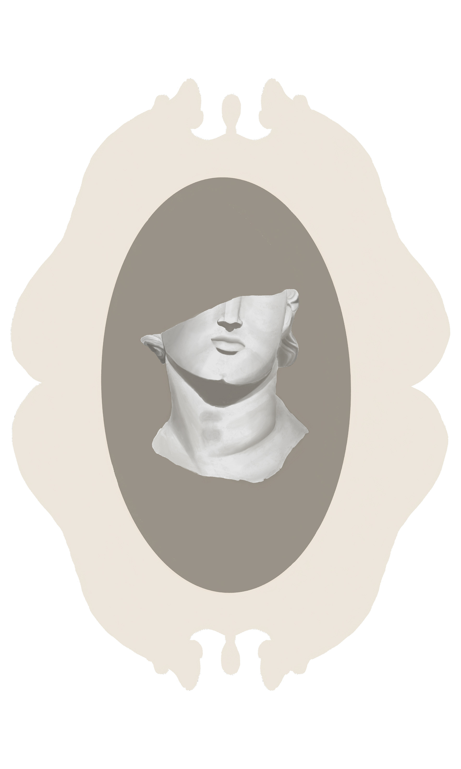
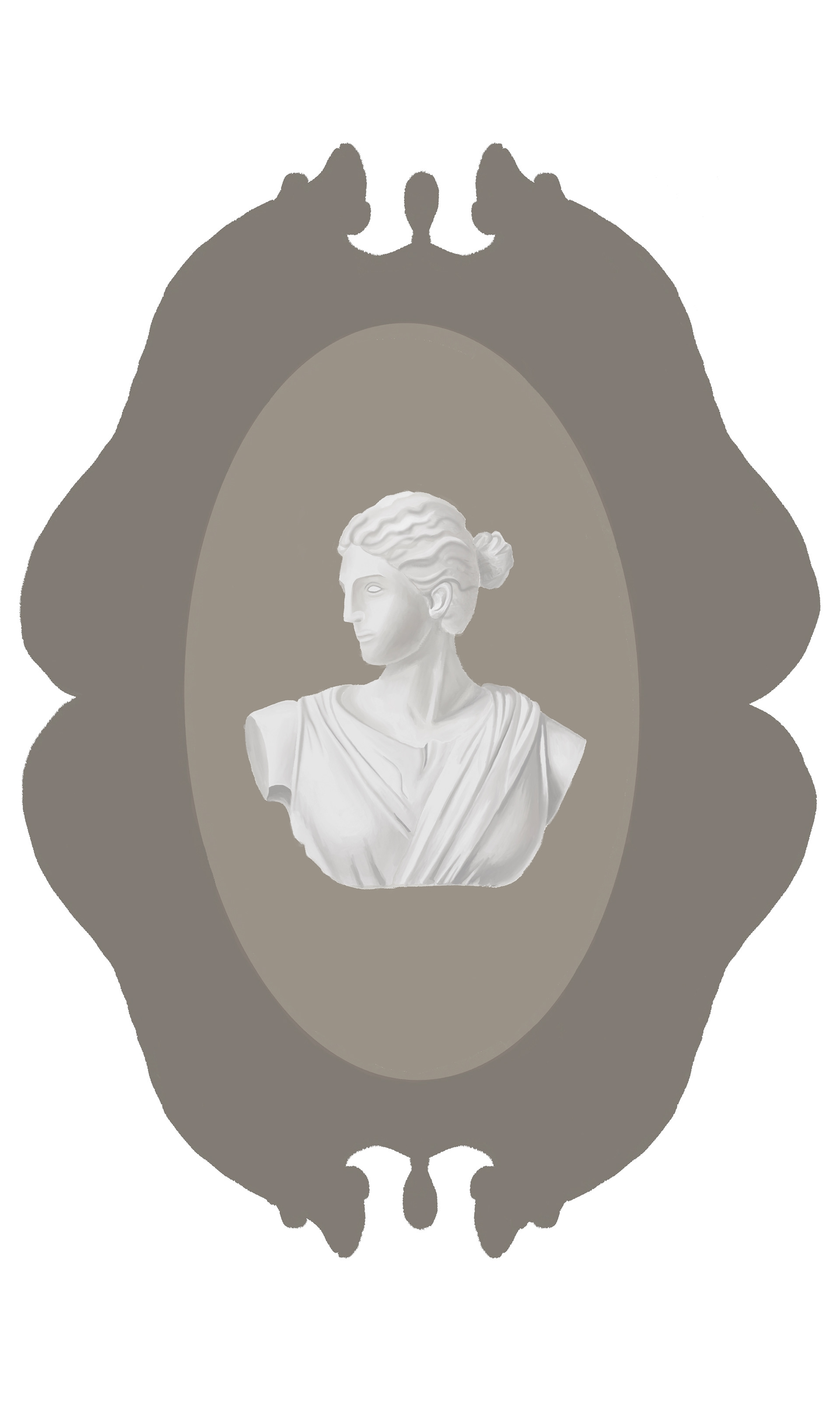
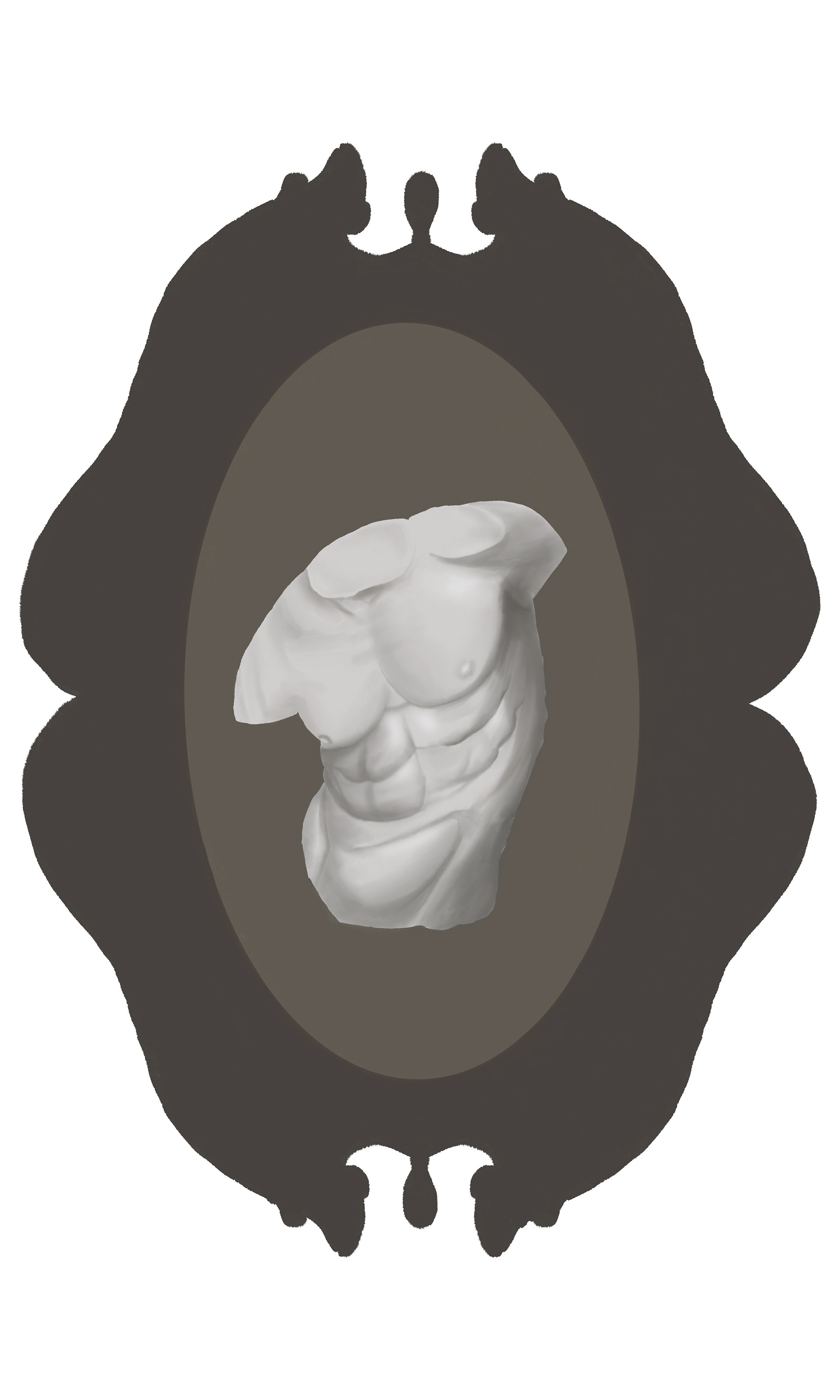
I started with the frames for the coffee bags, with each color representing a different roast, and each of them containing a different piece of sculpture. I initially tried doing 3 differently shaped frames, but I thought they looked more like a complete set and would sit better on a shelf together if they all shared the same frame.
I hopped around quite a bit with this project: once I rendered all the illustrations for one coffee bag, I shifted my attention to creating a pattern and the main/alternative logos for Urban Bean & Roasters. I wanted to capture the essence of the shop, while also showing all the different facets of their academia theme. I also made sure to stick to a muted color palette that felt appropriate for books, coffee, and antiques.
Logo Designs
The book logo is the coffee shop's primary logo, and appears on all library-themed content. This logo was applied to their illustrated coffee cup (below), which is a scene of various people studying and working at a library.
The typewriter logo is a reference to antiques and vintage items that are a part of this coffee shop's charm. The typewriter logo is used like a stamp for flat paper items (like the pastry bag below) and stickers. I wanted to make it clear that this coffee shop isn't just library-themed, so the typewriter in one of the alternate logos was an important part of doing that.
The second alternate logo is to be used when the name of the shop needs to be abbreviated, or when placed on top of a pattern or color that would become too busy/hard to see otherwise. It is placed on top of the pattern for the to-go bag, and it also appears on the coffee bags. Ideally the main logo would appear on the coffee bags, but I decided to use this one to keep the coffee bags looking minimal and sleek.
Coffee Bags
Once these logos were completed, I returned to the coffee bags to illustrate the remaining two. These ones were more straightforward now that everything else had been completed. After the illustrations were done, I added them to the physical bags and everything was functioning as a complete, cohesive set without looking uniform.


One of the things I was consciously trying to avoid was making everything look the same. Since this was a brand with lots of items, they could easily start to look identical if they had the same logo and similar artwork on them. Beginning with a more complex topic (dark academia) that naturally had many facets to it was helpful, as it gave me lots of different topics for illustrations.
My main struggle was trying to keep all of these different elements look cohesive, but not identical. Keeping to a similar art style and limited color palette was my main strategy for doing this, although the sculpted busts on the coffee bags were far more detailed than any other part of the deliverables. If I had more time I would ensure that every illustration had that level of detail, but having a deadline means you have to check yourself, evaluate what needs to be done, and decide when it is best to simplify or change strategies.
Mockups found through Freepik